
CTA Card block
Point residents to one important action with a card that stands out.
What it's for
A CTA (call to action) card highlights one thing you want residents to do — apply for a permit, sign up for alerts, register for a class. It has a title, a short supporting line and one link, led by an icon, a photo or nothing at all.
Add it to a page
Who can do this: City admins, in the website builder.
- In the left sidebar, open Content › City Pages.
- Find the page and click Edit. The page opens in the builder.
- In the Add blocks panel on the left, find CTA Card under Content. You can also type "CTA Card" in Search blocks.
- Drag CTA Card onto the page where you want it. Or select the block it should follow and click CTA Card to add it right below — with nothing selected, it goes at the end of the page.
- The new block is selected and its settings appear in the Settings panel on the right.
- A new card starts as a complete example ("Card title", "Learn more"). Click Edit settings in the Settings panel (or double-click the block) to open the card builder.
- Fill in the Title, Description, Link text and Link.
- Under Appearance, choose the Size and Media, then the icon or photo.
- Click Done.
- Your changes save as a draft as you go. Residents see them after you click Publish — or Ready for review, if your city reviews page changes.
Settings
In the side panel
The CTA Card has no side-panel settings. Everything is in the Edit popup.
In the Edit popup (Card builder)
Content:
- Title — Required. The card's heading, such as "Apply for a building permit". Up to 200 characters.
- Description — Optional. A short supporting line. Up to 500 characters.
Link:
- Link text — The link's words, such as "Start an application". Up to 80 characters.
- Link — A page path like "/permits", a full web address, or click Browse to pick a document, topic, post, event or page in Peny.
- Link color — Default: your city's brand color.
Appearance:
- Size — Standard (default): a card with the media on top. Compact: a one-row strip with small media, the text and the link.
- Media — Icon (default), Photo or None (text only).
- Icon and Icon color — When Media is Icon. Pick an icon; its tile is tinted with the icon color. Default color: your city's brand color.
- Upload photo — When Media is Photo. A JPG or PNG up to 10 MB. Then fill in Alt text to describe it, or click Suggest to have Peny's AI write a description you can edit. Use Replace photo or Remove photo to change it.
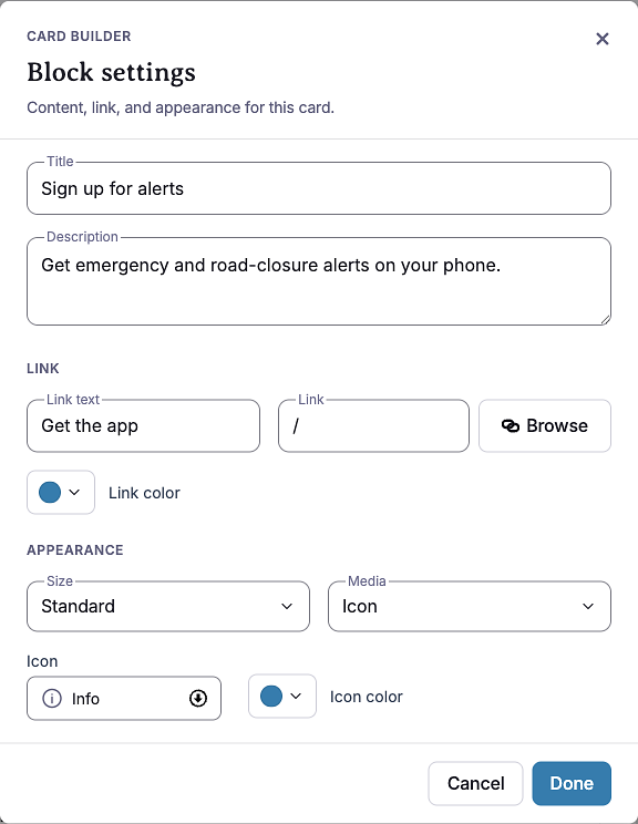
Photo changes go live right away
A new, replaced or removed photo — and its alt text — saves straight to the card. If the card is already on a published page, residents see the photo change as soon as you click Done. The rest of the card waits for Publish.
What residents see
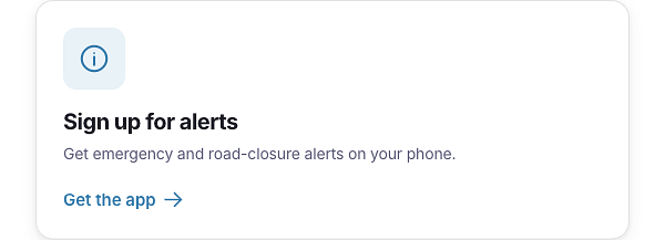
A white card with your icon, photo or no media, the title, the description and the link. The link only shows when both Link text and Link are filled in. If Media is Photo but no photo is uploaded, the card shows text only.
Tips
- Put cards side by side by placing them in a Container block's columns. On their own, cards are centered on the page.
- Use Compact for a row of smaller cards or a short reminder; use Standard when a photo or icon should lead.
- Make the link text say what happens, like "Start an application", not "Click here".
- Describe photos with Alt text. Cards with a photo but no description are flagged by the accessibility check.
- Headings: the card title is a level-3 heading, so put the card under a level-2 heading (for example, a Rich Text heading) on longer pages.
- Reuse a card: use Duplicate on the block's toolbar to copy it with all its settings.
Example
These are two live CTA cards inside a two-column Container: a Standard card on the left and a Compact card on the right, both with an icon.